- TouchPoints
- Posts
- Beehiiv, Miro, Descript
Beehiiv, Miro, Descript
The inaugural TouchPoints Issue on our new platform, Beehiiv
Noah Stambovsky
January 09, 2024
Welcome to TouchPoints, the newsletter that breaks down marketing collateral from top SAAS brands for inspiration and analysis.
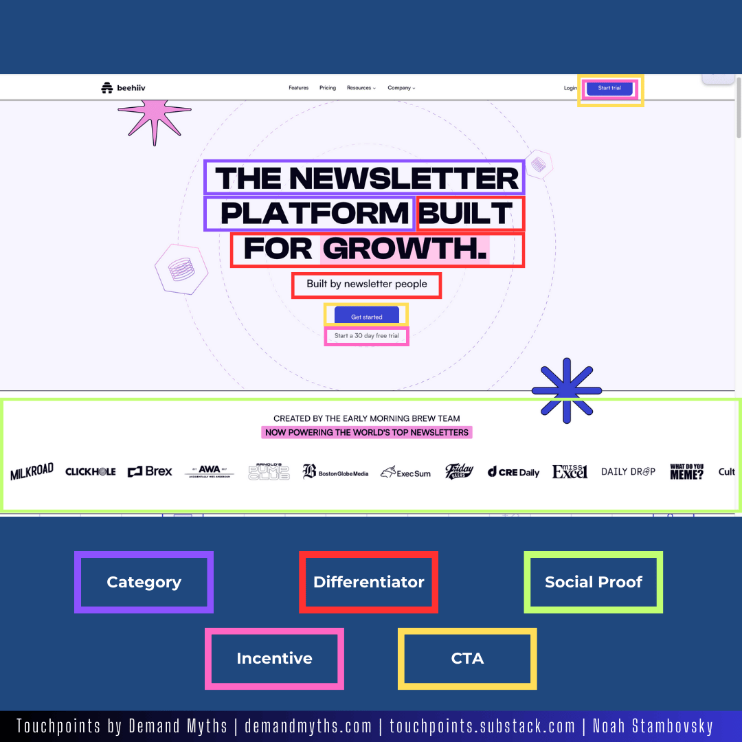
This issue is special, because it is our first issue on our new platform, Beehiiv. To commemorate this momentous occasion, we’re breaking down Beehiiv’s homepage first. Let’s dive in!
Beehiiv
Newsletters & Blogs
Founded 2021
11-50 employees
Homepage
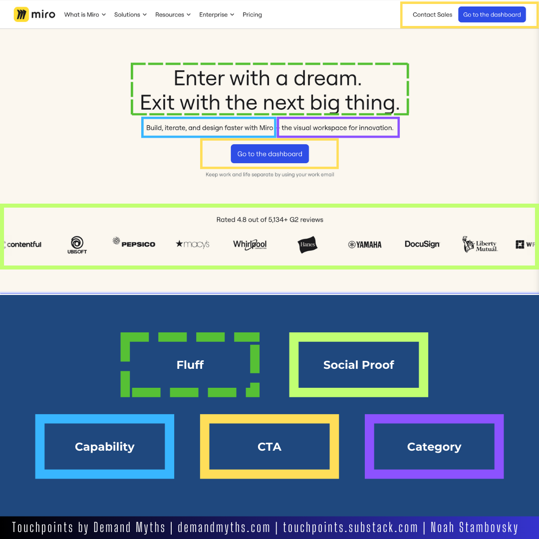
Miro
Collaborative Process Mapping
Founded 2011
1000-5000 employees
Homepage
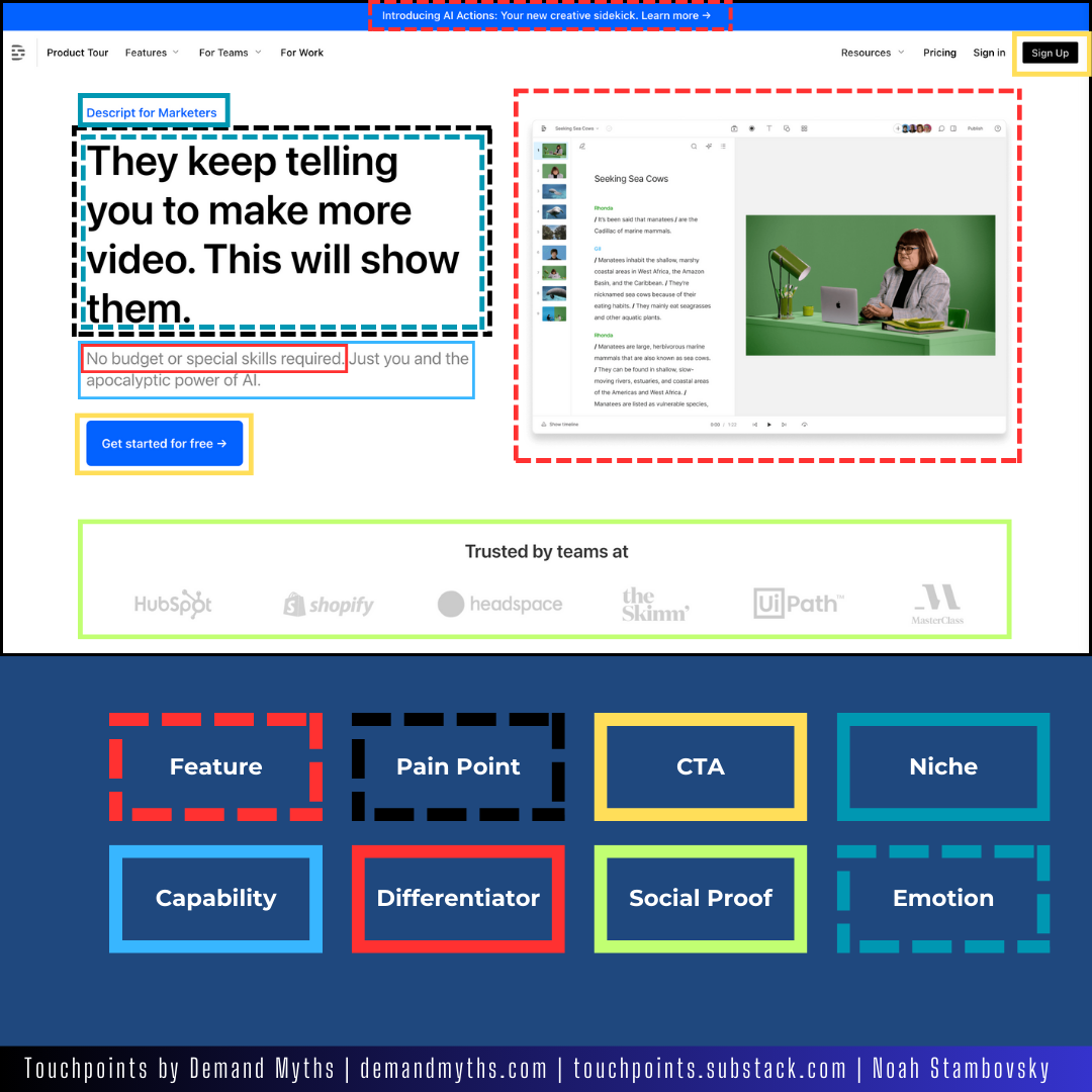
Descript
Video & Podcast Editing Software
Founded 2017
51-200 employees
Landing Page - “For Marketers”
Observations
A Note About The Elements of Copy
In this issue, I added three elements never-before-annotated in TouchPoints.
Fluff
I have run into this a few times before, but allowed it to go unhighlighted.
For Miro’s homepage above, I saw the following line:
Enter with a dream. Exit with the next big thing.
I find this to be quite vague, and had to wonder :
“If I had NEVER used Miro (I have) how would this copy help me make a decision?”
It does sound nice. And for someone who has a basic understanding of Miro’s product, it is even enticing.
But, it does not truly promote a feature, capability, or any of the other elements of copy. You could argue it is an “outcome” claim, though I would reject that on the grounds of it’s vagueness.
I’m curious if this headline has been A/B tested, and if so, what alternatives did it beat out?
My humble offer for a capability focused alteration:
Plan the Next Big Thing
Emotions
On Descript’s “for marketers” page, the headline was an extension of a statement about the prospect’s niche. This line:
They keep telling you to make more video. This will show them.
It is not only directed at marketers. It’s playing on their pride.
Emotions may not always be so closely paired with niche descriptors, but for this instance, I made the color code the same, and gave the niche the solid line, and the emotions the dotted.
Pain Point
The more I look at Descript’s headline, the more I like it. Those simple two sentences manage to be both casual and understanding. A very good “we get it” vibe.
The headline also serves/contributes to these elements of copy:
Pain Point
Emotion
Niche
Capabilities
Outcomes
I think the last three are more implied that stated, hence their omission from that part of the annotation.
The headline is just about perfect for a “for marketers” page.
I do wonder if that is the situation people are finding themselves in? It didn’t even resonate with me that much but I feel like I can see it resonating with others.
Did you find it resonant? Reply to let me know.
Know of a coworker, friend or relative who might like touchpoints? Click below to share it with them.
Acknowledgements
I would like to extend our thanks to the following companies for providing examples and insights that made this edition of Touchpoints possible:
Milled.com - For their marketing intelligence platform identifying trends.
Peer Signal - For using data to showcase high performance digital growth strategies.
Crunchbase - For their database of innovative companies to learn from.
Zoom Info - For excellent data about the featured brands.
Linkedin - For their great transparency in their ad library, and company information
Beehiiv - For being an awesome provider of newsletter creation and delivery services.
I sincerely appreciate these companies for providing great tools for research. It's collaborators like them that allow us to deliver the best of modern SaaS marketing to you, our subscribers, every week in TouchPoints.
Thanks for reading Touchpoints! Subscribe for free to receive new posts and support my work.